What If Analysis
Excel Template
What's Inside the What If Analysis Template?
Details | 2 Sheets
Supported Versions | Excel 2010, 2013, 2016, 2019, Office 365 (Mac)
Category | Finance, Data Analysis
Tags | Payback Period, Repayment Scenarios, Investment, Risk


Why Professionals Choose Simple Sheets
It's simple. Access to the largest library of premium Excel Templates, plus world-class training.

100+ Professional Excel Templates
Optimized for use with Excel. Solve Excel problems in minutes, not hours.

World-Class Excel University
With our university, you'll learn how we make templates & how to make your own.

How-To Videos
Each template comes with a guide to use it along with how-to videos that show how it works.
Inside Our What If Analysis
Excel Template

Whether you are buying a business or a home, understanding your repayment scenarios and break-even period is crucial to understanding the merits of an investment. Our What If Analysis Excel Template is designed to calculate and display different repayment scenarios, with dynamic formatting and graphs, to bring your data to life.
Before we dive into this template, you may also find our Break-Even Analysis, Loan Amortization Schedule, and Business Valuation Excel Templates useful.
Let’s jump into how this spreadsheet works.
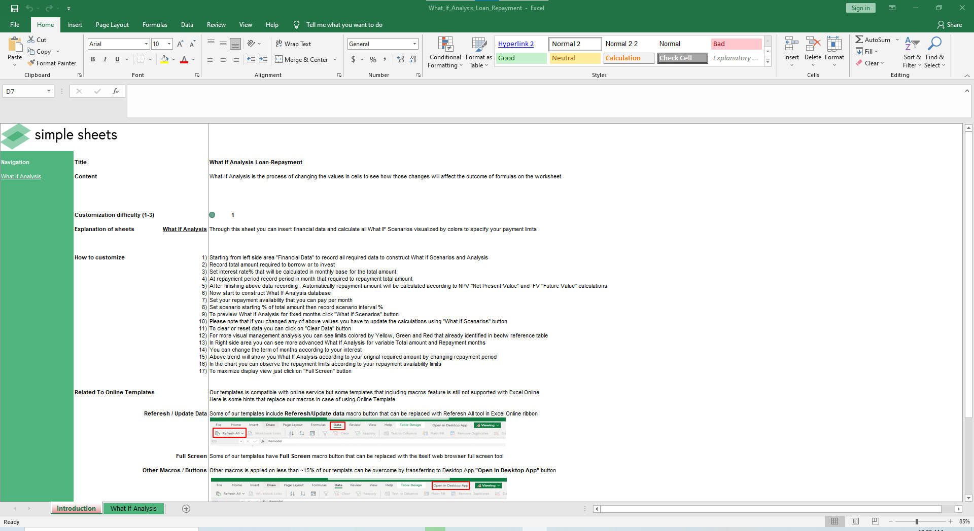
This is one of our favorite templates due to the simplicity and visualization. There is one usable sheet and seven fields in this template so within minutes you can generate insightful data.
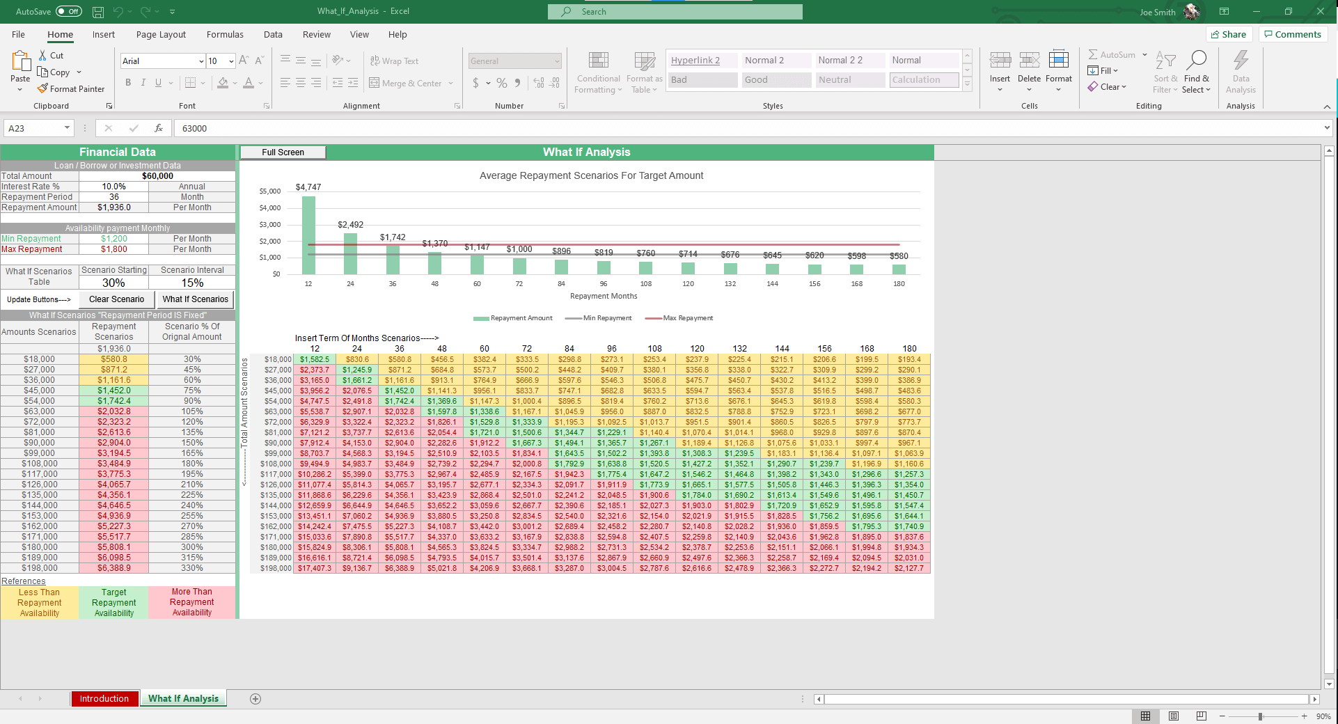
Under the Financial Data section, fill out the Total Loan Amount, Annual Interest Rate %, Repayment Period in Months.
The Repayment amount will be calculated according to the Net Present Value (NPV) and Future Value (FV) calculations. Set your minimum and maximum repayment ability per month.
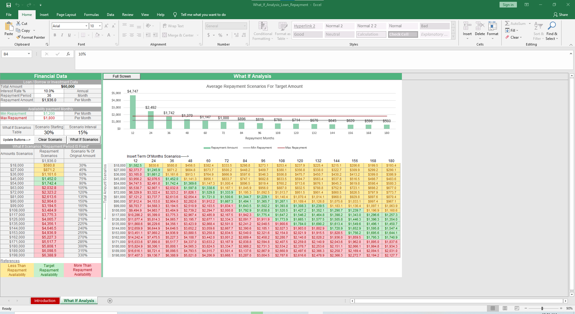
To calculate your What If Payment scenarios, choose your Scenario Starting % and the Scenario Interval %. Once you’ve entered those fields, click the What-If Scenarios button. Your Amount Scenarios, Repayment Scenarios, and Scenario % of Original Amount will calculate in the three columns below.
For a wider range of scenarios, the table on the right presents Monthly Terms on the horizontal access, ranging from 12 months to 180 so you can view payment terms along the longer horizon. The vertical axis displays the Total Amount Scenarios, ranging based on your inputs.

As you will notice, the cells are color-coded like a stoplight - green, yellow, and red. Cells in green represent repayment scenarios that fall within the range of your minimum and maximum repayment scenarios. Red cells indicate terms that are higher than your maximum repayment scenario. Yellow cells indicate terms that are less than your minimum repayment scenario.
These are especially helpful as you visualize what is financially feasible and what is a stretch in regards to repayment.
Last but not least is the Average Repayment Scenario for Target Amount graph that charts the Repayment Amount, Minimum Repayment, and Maximum Repayment.
Although this template is simple, the dynamic formatting and graphs make it extremely powerful and usable.


