SaaS Metrics Dashboard
Excel Template
What's Inside the SaaS Metrics Dashboard Template?
Details | 5 Sheets
Supported Versions | Excel 2010, 2013, 2016, 2019, Office 365 (Mac)
Category | Strategy & Management
Tags | Business Model, KPI, Recurring Revenue, Subscribers, Startups

Why Professionals Choose Simple Sheets
It's simple. Access to the largest library of premium Excel Templates, plus world-class training.

100+ Professional Excel Templates
Optimized for use with Excel. Solve Excel problems in minutes, not hours.

World-Class Excel University
With our university, you'll learn how we make templates & how to make your own.

How-To Videos
Each template comes with a guide to use it along with how-to videos that show how it works.
Inside Our SaaS Metrics Dashboard
Excel Template
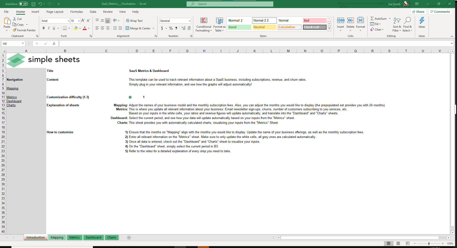
One of the most successful business models born from the internet is software licensed on a subscription basis, also known as Software as a Service.
Founders and investors alike love the predictability and recurring revenue of SaaS businesses. Whereas some business models require companies to constantly be acquiring new customers and selling additional units, SaaS businesses rely on retention of their existing customer base.
The goal of our SaaS Metrics Excel Template is to give you a birds-eye view of the financial health of your company.
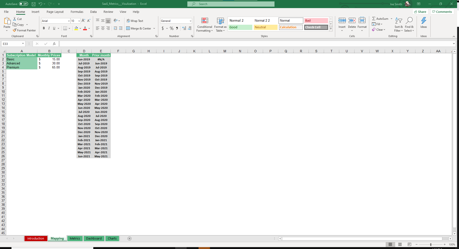
Start by inputting the Subscription Models and their corresponding price tags as well as the months you’d like to display.
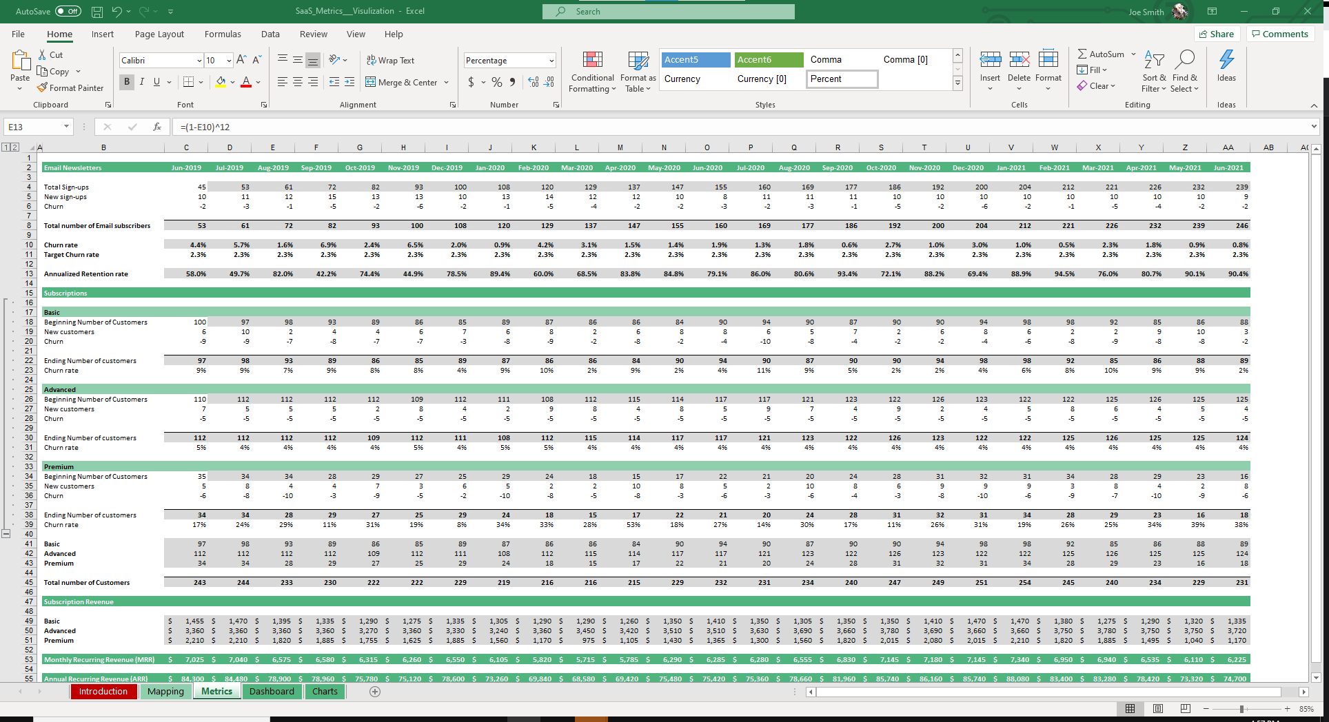
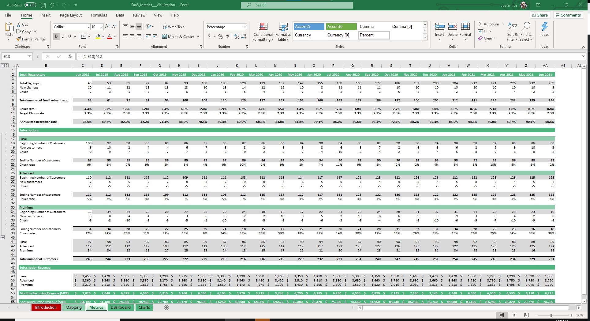
Navigate over to the Metrics sheet and you’ll notice four sections. The first being Email Newsletters. The other three being the Subscription options you entered in the Mapping sheet.
Fill out each section with your company data. A few of the fields you’ll be entering data in for: Total Sign-ups, New Sign-Ups, Churn and New Customers.
All of our templates have logic pre-built into them. That means you mostly just have to input the data you have and our template spits out the desired information. In this sheet, it will automatically calculate numbers like Churn rate, Annualized Retention Rate and Recurring Revenue.
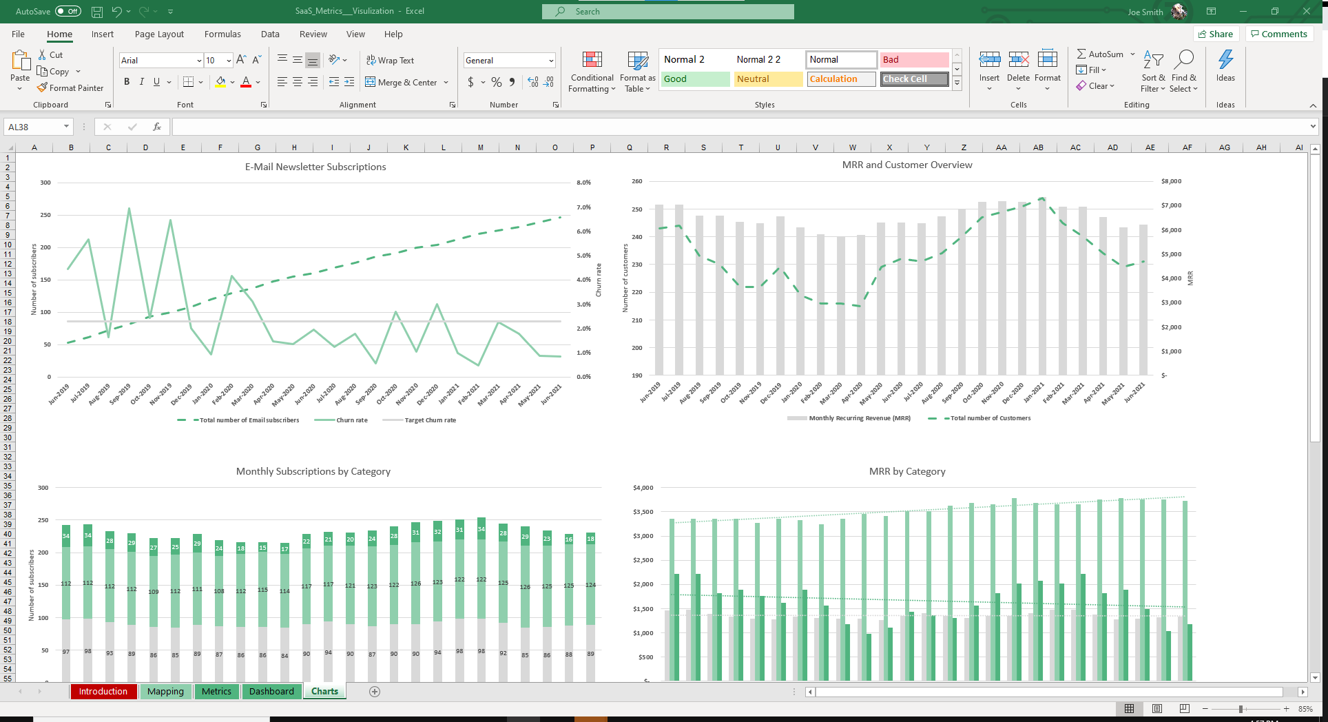
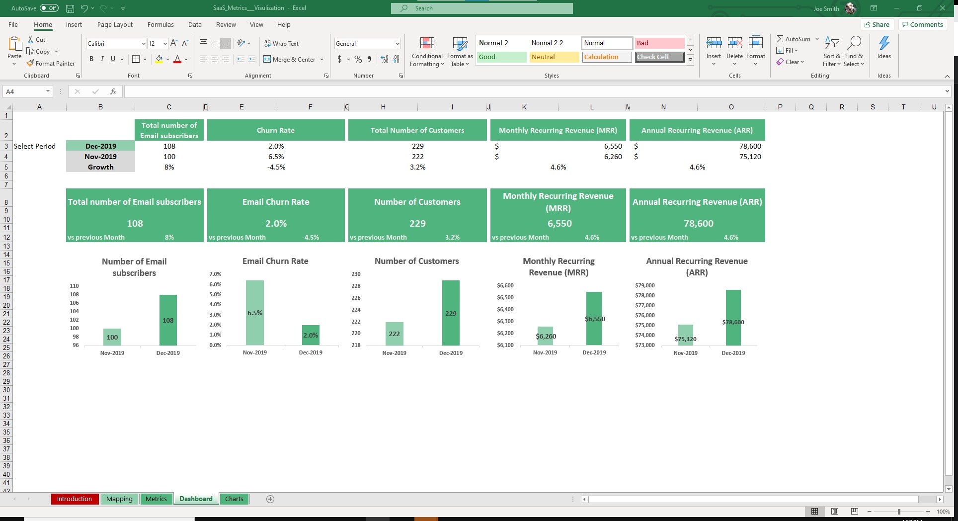
The next two sheets are built for managers. The Dashboard and Charts sheet auto populate graphs and charts based on your data from the previous two sheets.
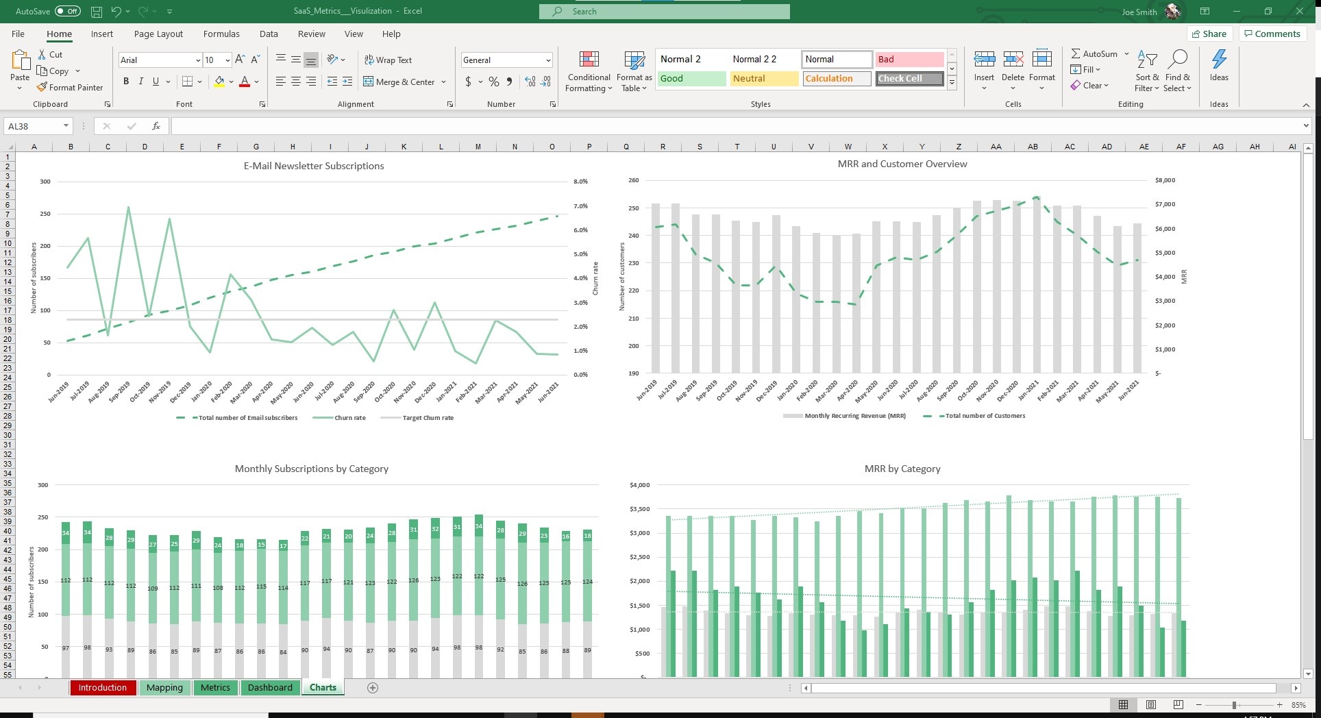
This is especially helpful for management, founders and investors who want to see trends and a summary of the business.
On the Dashboard sheet, select the Period for which you want to compare metrics. Instantly, you can visualize and compare your most important metrics related to churn, MRR and ARR.
In the Charts tab, all your data will be compiled and displayed over a 24+ month time period.
As Peter Drucker once said, you cannot manage what you can’t measure.
Measure and manage the most pressing KPIs for with our SaaS Metrics Dashboard.


