
Scatter Diagram
Excel Template
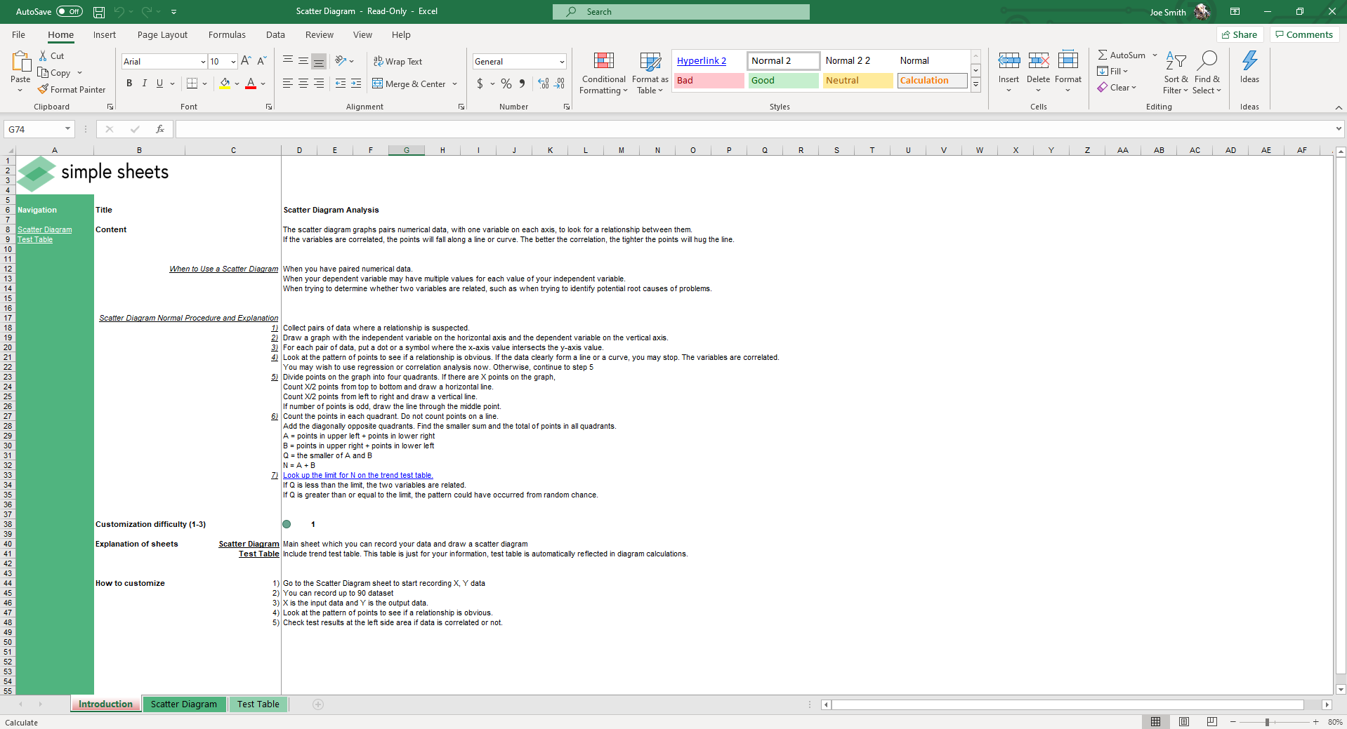
What's Inside the Scatter Diagram Template?
Details | 3 Sheets
Supported Versions | Excel 2010, 2013, 2016, 2019, Office 365 (Mac)
Category | Operations, Data Analysis
Tags | Axis, Correlation, Relationship, Plot, Six Sigma, Lean

Why Professionals Choose Simple Sheets
It's simple. Access to the largest library of premium Excel Templates, plus world-class training.

100+ Professional Excel Templates
Optimized for use with Excel. Solve Excel problems in minutes, not hours.

World-Class Excel University
With our university, you'll learn how we make templates & how to make your own.

How-To Videos
Each template comes with a guide to use it along with how-to videos that show how it works.
Inside Our Scatter Diagram
Excel Template
When you're working with large sets of data, finding patterns or relationships between variables can be difficult and time-consuming. Manually creating scatter plots in Excel takes effort and can lead to errors, especially if you don’t have the right tools.
Our scatter plot Excel template solves this problem by automating the entire process. Simply input your data, and the template quickly generates an accurate scatter plot for you. You don’t need to be an Excel expert to visualize trends and correlations!
What Is a Scatter Plot?
Also known as a scatter diagram, a scatter plot is a type of chart used to visualize the relationship between two sets of data. Each point on the graph represents a pair of values, one from the x-axis (horizontal) and one from the y-axis (vertical). The scatter plot helps to identify patterns, trends, or correlations between the two variables.
- When there’s a clear pattern, the points will form a line or curve.
- No pattern means the points will be scattered randomly.
- Correlation is often shown by how closely the points cluster together. A strong correlation means the points align closely along a line.
Why Use our Scatter Plot Excel Template?
This scatter diagram Excel template helps you save time and improve the accuracy of your data analysis. Here’s how:
- Quick and easy to use: You don’t need for complex formulas. Simply input your data, and the template does the rest.
- Accurate results: Automatically calculates key values like correlation and regression to ensure your analysis is precise.
- Clear visuals: The scatter plot provides a straightforward visual representation of your data, making it easy to spot trends and patterns.
- Saves time: Automating the creation of scatter plots and calculations means you spend less time on manual tasks and more time on insights.
- Helps with decision making: Whether you’re in business, research, or education, this template helps you make data-driven decisions by clearly showing relationships between variables.
Inside the Scatter Plot Excel Template
This Excel scatter plot template includes everything you need to analyze your data effectively:
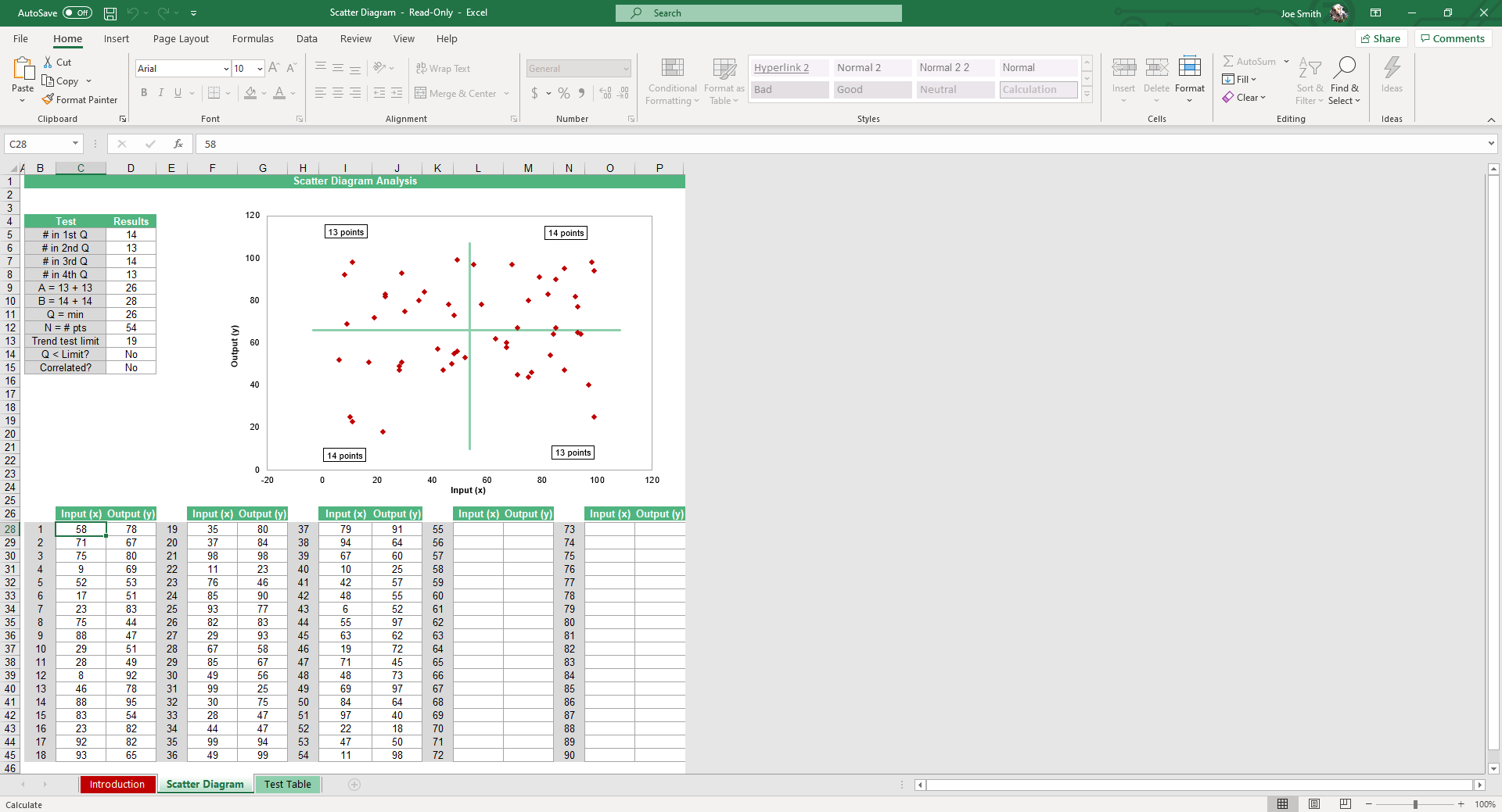
- Data input section: Easily enter your x and y values to create a scatter plot.
- Scatter plot chart: The template generates a clear, visual scatter plot. The plot automatically updates when you change your data.
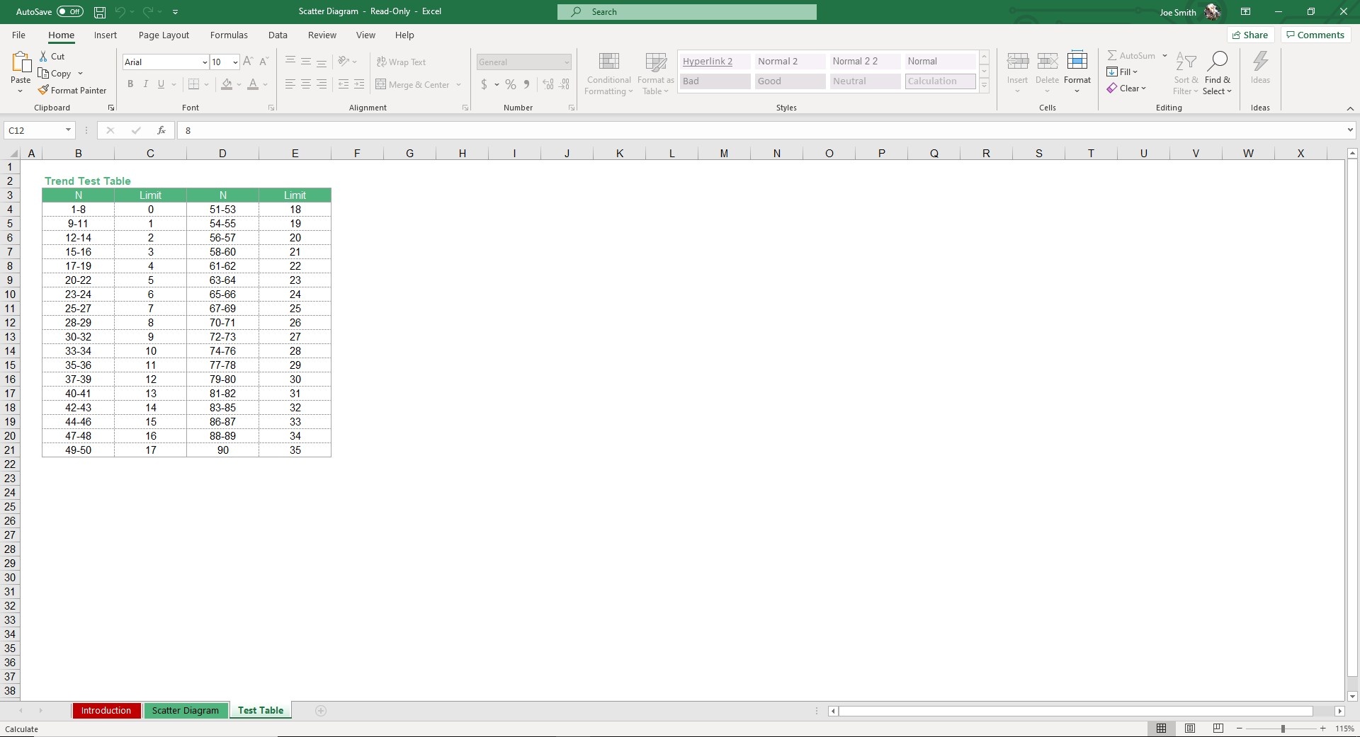
- Test table sheet: A supporting sheet that helps analyze trends and validate results. It calculates the number of data points in each quadrant of the scatter plot and provides statistical analysis to ensure your scatter plot is meaningful.
How To Use the Scatter Plot Excel Template:
We have designed the scatter diagram Excel template to be simple and quick. Here’s how to get started:
- Enter your data: In the Scatter Diagaram Sheet, type your x (input data) and y (output data). You can enter up to 90 datasets.
- Generate the scatter plot: Once your data is entered, the template will instantly create a scatter plot, displaying your values on the chart.
- Analyze trends: Look at the chart to identify patterns. If the points form a line or curve, you’re seeing a relationship between the variables.
- Check test results: On the left hand side, you can see if the data correlates or not.
Who Is The Excel Scatter Plot Template For?
This scatter plot Excel template is perfect for anyone who needs to analyze data quickly and easily, including:
- Students: Ideal for assignments, projects, and understanding data relationships.
- Researchers: Great for visualizing data and identifying patterns in your studies.
- Business professionals: Perfect for analyzing trends, making data-driven decisions, and presenting findings.
- Small business owners: Helps you track performance, sales trends, and customer data.
- Managers: Useful for analyzing team performance or project data and making informed decisions.
Download Now
Ready to start analyzing your data with ease? Download the scatter plot Excel template now and start creating accurate scatter plots in just a few clicks. It is compatible with all versions of Microsoft Excel, including Office 365.
With this scatter diagram Excel template, you’ll be able to visualize trends, calculate correlations, and make data-driven decisions faster than ever. Don’t wait. Get started today!
More Templates Like This
Simple Sheets offers even more helpful templates to enhance your data analysis. Along with the scatter plot Excel template, you can access templates for Box and Whisker Plots, Stratification Data, and Panel Analysis. These templates will help you streamline your workflow and make informed decisions.
More Data Analysis Templates For You


